Here's another layout I created with the beautiful papers from the American Crafts Letterbox line that Jill at Memorable Seasons sent me to work with this month.
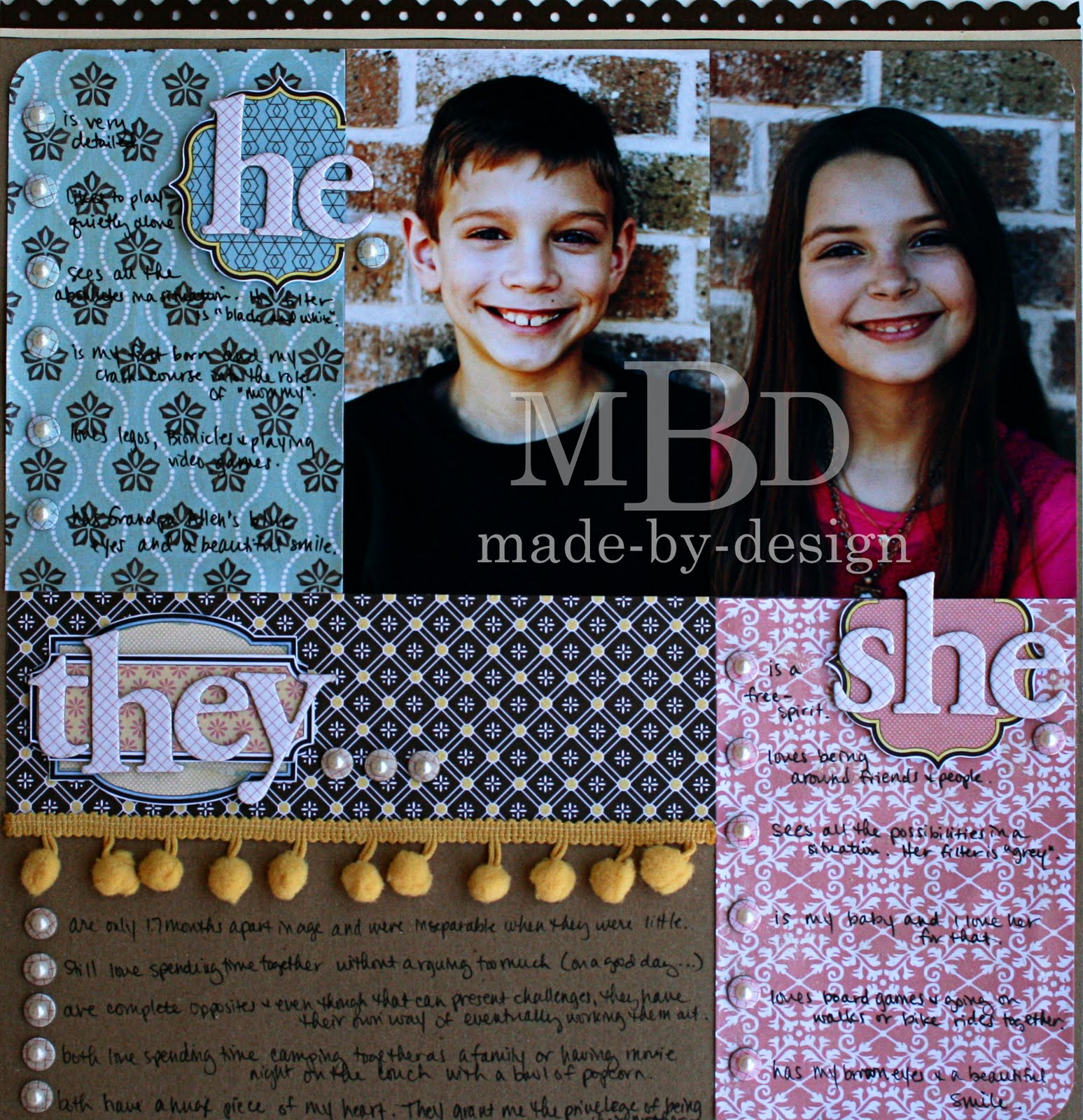
I was inspired to create this layout with these photos I had sitting on my desk. My original thoughts were he/she for the title with just the pink and blue paper and the photos in the center of the layout. But I knew there was more to my journaling that I wanted to add instead of just the differences between them--I wanted to include their similarities. So the layout evolved into this as I was pushing the photos around on the page. I LOVE how this turned out. Kind of reminds me of a Venn diagram where you have the two distinct circles and then the part in the middle where they are combined.

 For each section, I used the chipboard letters to set them apart. My son's section was titled "he" and I used the blue paper for the background. My daughter's section was pink and it was titled "she". The smaller label for each section was handcut from the label paper and I colored the edge yellow with a marker to tie them both together with the combined "they" are. The letters are stuck on top of the label and the labels are attached with foam tape.

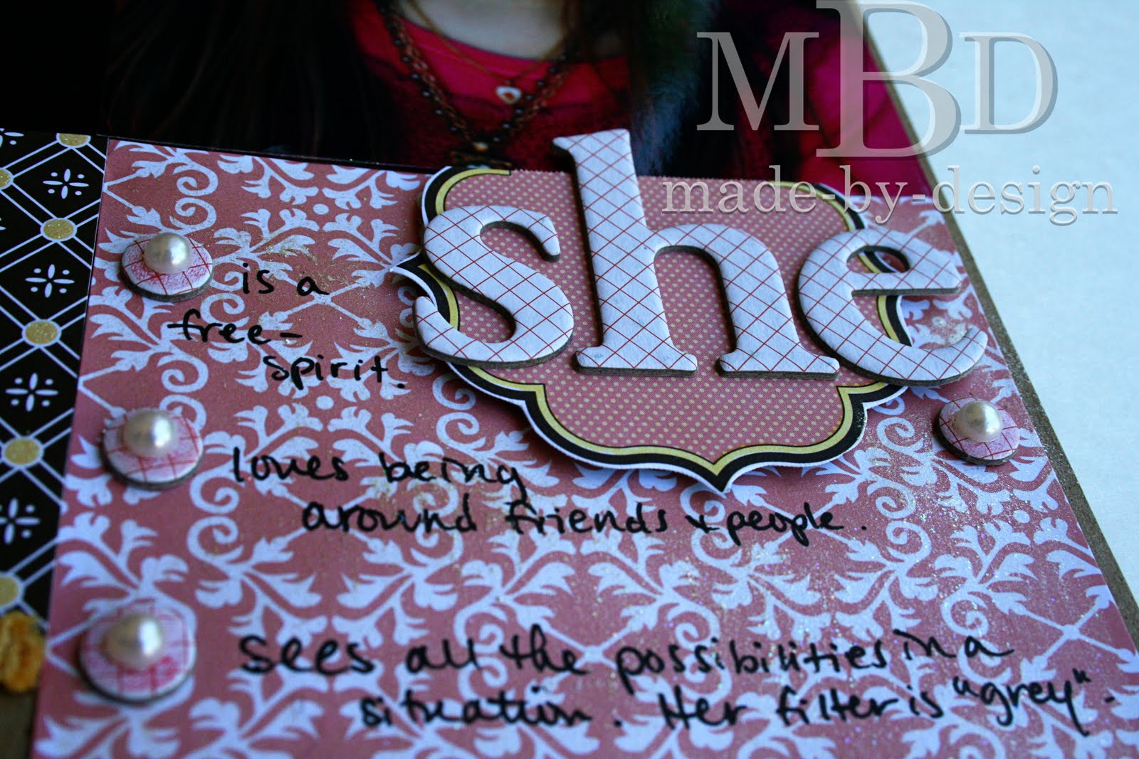
For these photos, please ignore that the coloring is off...they were taken inside under different lighting conditions, and they were the best I could get. :) I wanted to show how I added the chipboard circle dots for the bullet points of each section. At first, I just had them on the layout straight out of the package, with no changes. They were a little too white looking, so I tinted them with ink from an inkpad and a Qtip. I had to combine several colors to get the correct shade, but I love how easy that was with the Distress inks. They are perfect for custom blending. For the blue section, I used Antique linen first, then added some Tumbled Glass on top. The finished layout has small pearls added on top of the chipboard circles and I love how it looks. Here's the pink side with the bottom circles custom colored with the Worn Lipstick over the Antique linen and the top ones are tinted with the Antique linen shade only.
Here's the tan layer (below). I used Brushed Corduroy directly on these white circles and didn't need to mix them with any other color. The top circles are the original white color.

The section at the bottom was called "they". This is where I combined their similarities and was able to highlight my favorite ones. The main color for this section was yellow, although I tried to tie in the blue and pink too. The label was basically done the same as the other two titles, except I wasn't able to use just the yellow label on the bottom since one side was cut off as the paper was printed with labels overlapping the edges of the paper. I worked around this by adding another label on top. The big yellow label on the bottom has a blue outline that I colored with a waterbrush and some of the Tumbled Glass and Antique Linen ink mixed together on my craft sheet. It's not as clean of a line as the other two, and you can see where some of the color bled into the tag a little, but I like the look anyhow. The top label used more of the pink color, so that is why I colored the bottom label with the blue so all three colors were incorporated into this section.
 Here's another shot of the left side of the layout so you can see how everything was layered. I also used the ball fringe and I love how it turned out on the layout! I just glued it down with my regular ATG tape and then where the ends were cut, I added a little glossy accents to keep them from fraying.
 I hope you enjoyed today's layout share! :)

The section at the bottom was called "they". This is where I combined their similarities and was able to highlight my favorite ones. The main color for this section was yellow, although I tried to tie in the blue and pink too. The label was basically done the same as the other two titles, except I wasn't able to use just the yellow label on the bottom since one side was cut off as the paper was printed with labels overlapping the edges of the paper. I worked around this by adding another label on top. The big yellow label on the bottom has a blue outline that I colored with a waterbrush and some of the Tumbled Glass and Antique Linen ink mixed together on my craft sheet. It's not as clean of a line as the other two, and you can see where some of the color bled into the tag a little, but I like the look anyhow. The top label used more of the pink color, so that is why I colored the bottom label with the blue so all three colors were incorporated into this section.


2 comments:
gorgeous page! love how it is like a venn diagram!! and how you jazzed up those cardstock circles :)
Love this layout. Everything came together perfectly.
Post a Comment